Generic convention and analysis
A digipak is an advertisement that show the process of an album. The impact that looks at the artist and finds out further information about the artist.
Conventions:
- information that relate to the album
- most relate to the genre of the text such as the barcode, colour and title.
The purpose of a digipak:
- The marketing tool that goes on the Cd
- provides information about the artist and the album
- Different songs on the album
- Advertisement appeal to the target audience. informing the audience
- Attract a particular target audience
- Creates, feeds into the representation of the star image.
- A product to keep hold of collectors item.
Elements of a digipak:
- Artist names and album title.
- Lists of the song that will appear on the album
- Production company details.
Analysing two examples that are similar to mine using the following conventions:
Main convention of an album magazine advert
Name of the artist or band
The date of when the album will be released using the album cover image on the advert features.
the rating from different magazines and newspapers.
Where the album can be purchased from
A small picture comes with the digipak that comes with the album.
The artist name is written in calculator style font and this is the biggest writing on the cover. so this is clear for whose album is even if the audience ain't familiar with Calvin harris's face.
The bright background colour yellow which will straight away catch the viewers attention.This is a good advertising for the album because its hard to miss so many people will stop and look and read it.
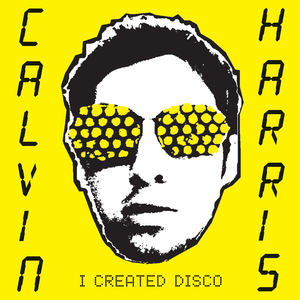
The background of the advertisement is the same as the actual Cd cover. so the advert and the CD cover will look similar but the advert will have more detail and less image.
The album title is written in a calculator style font which this fits with the electronics style of the album.

The image is used is quit artistic there's a lot of levels of contrast making David Guetta stand out more as he stand out the shadow.
The black and white style help the title for the album. 'one love stand out. colour pink is a stereotypical colour to be used in house genre. The font of the album title is like paint. this is quit messy this could suggest that it is n't something like classical music and that it is loud and fun.
The layout of this digipak is kept very simple which leaves the audience wondering what contents could be like as not much has been given away from the front cover itself allowing the music to speak for it self.
The back page of the digipak is kept simple with the white and pink colour scheme, this is allowing you to focus purely on the track names. the messy theme throughout.


