Tuesday, 24 March 2015

Planning: Characters

                                                                   Planning characters


How we want to represent our characters as they are arguing and having relationship issues.it is clear to see that there is tension in the relationship through the body language and space between them.


The female artist:
Want her to look isolated and be alone in an empty room like the female in ‘Love the way you lie’ to show how miserable she is feeling.


The male artist:

We want him to also look alone, but show is anger and frustration more in his body language and fed up facial expressions.
 
 
Analysis of music videos which portray relationship issues:
This is the relationship we want our characters to have within the video. It is clear that they are having problems in their relationship which is why we want to show them together arguing a lot, but individually looking upset and alone. We want our visuals to portray a difference in representation for each character. The female will look more sad and upset by what has gone on which is conventional to her gender stereotype, and the man will look more angry and frustrated, suiting his gender stereotypes.


My male character


Name: Sezer
Age: 18
                                                       Ethnicity: Turkish
Gender stereotype of role: He will take on the role of a classic male who is dealing with relationship issues. He will be masculine, for example, he will shout a lot during arguments and go to the gym to release his anger and frustration.

 
Costume: He will wear sports clothing to suit the idea that he has gone to the gym. This will be dark though to reflect his sad emotions. He will also wear his hood up when training to show how he wants to forget about everything that is going on.  
Body language and facial expression: he will have an angry facial expression when arguing so people buy into his feelings and when working out, he will look focused and determined to show he wants to forget about all his problems at home and take out the frustration on his actions, which is what men do.
Role within the music video: he will play the boyfriend who is having issues with the female character in the video. He will be quite an angry guy to show how ‘everyone loves a bad boy’ and this is the representation we want him to have.  
My female character:
    Name: Jemima
     Age: 18
  Ethnicity: Black
Gender stereotype of role: She will take on the role of a classic female who is really upset with the problems in her relationship. She will be very elegant and feminine to show she is a classic girlfriend figure and so the audience feel sorry for her. Where the male character will go to the gym to deal with his issues, she will stay at home and deal with her problems in a domestic way.
Costume: she will wear, grey track suit and white top to suit the idea that she's at home. This will show that she is at home relaxing in calm environment even through she is going through pain in her relationship try to remain calm in her own space.
Body language and facial expression: she will have an frustration facial expression when she is arguing so that people could understand what she is going through, she will be sitting on show that she is at breaking point  as she will be staring into the camera so that people relate with what she is feeling. This is something what women do when they are going through relationship they feel low about themselves.
Role within the music video: she will play the girlfriend who is going through problems between the male character in the music video. she will appear annoying and always complaining. this is the representation we want to have.  


Planning:Editing

                                                       
                                                               Planning editing
 
Editing is important in music videos because it can help set the mood of what is going on in the music video. When the sounds are manic and upbeat, the editing should reflect this. Through edits and transitions, we can make our video look better which is why it is important to plan it. Goodwin discusses that the editing to match the pace of the song so it is conventional to do this.

The editing I plan to use in my music video consists of the following:
·         1. Jump cuts. The music is very fast paced when the chorus kicks in, therefore we will use a lot of jump cuts to show him going hard at the gym to get over his troubles.

·         2. Reaction shot. When the couple are having a full blown argument, we will use a reaction shot to show the emotions of the characters so the audience can understand their pain and love for each other.

·         3. Change of pace. The song starts of slower than the chorus, so when the fast beats come in, the edits will be a lot faster to follow Goodwin’s conventions.

·         4. Slow motion. We will use this feature to show the happier moments of their relationship to show they are reflecting on their happier times.

·         5. Fade to black. We will use this when there is a dip in sound in the song to show that the audience are unsure on how a certain argument has ended, has the male character hit her? This is what we want to show with the use of editing.

Planning: Lighting and Colour

                                                          Planning and colours.


Lighting and colour– Leona Lewis (Trouble)
The lighting is natural and high-key lighting which adds a very natural and soft tone to the break-up events in the music video. There are also moments of low key lighting which is mainly shown to display the struggles and pain the couple are going through in their relationship. What I like about this video is that lighting is the convention that allows the audience to recognize the good and bad times between the couple. The colour almost has a bright, almost vintage look to it which suits the genre of Pop as it is a slow song and sets the mood for the heartbreak events.  


Lighting and colour – Eminem (Love the way you lie part2)
This is similar to the ‘Trouble’ video where the lighting is a mixture of low-key, high-key and natural depending on what is going on in the narrative. When the couple are arguing, we see more low-key lighting being used and high key at the happier moments. I really like the way colour is used here as there are tinges of orange and yellow to show the pain and disaster that is going on in this scene about their relationship. High key lighting is used to show the artist and enhance their ‘star image’.


Similarities in the video when it comes to colour:

* Mixture of lighting to represent different moods in the narrative
* High key lighting on the artist
* Colour to reflect the emotions on what is going on in the scene


What lighting I will use in my video:
* High-key on the artist
* Low-key when things are going really bad in their relationship 
* Natural and high-key on the happier moments in their relationship
* Colour such as orange and red to show the anger, love and passion that the couple have for each other. 

Friday, 27 February 2015

Question 2:How effective is combination of your main products and ancillary texts?


Final Product: Advert


I really think this is also a conventional product and advert to promote our new album. The key information such as the album is clear for the audience to see which tells them vital information.
The artist image is well represented which is consistent throughout all my products.
The use of editing is conventional to the genre as it enhances his 'star image' as there is high-key lighting around him. Finally, the use of the location is conventional as we see him in a park in the video, and each location used in each product has an outdoor feel to it which will appeal to the audience.

Final Product: Digipak


Here is my final digipak. I believe it is conventional to the House genre because there is a clear artist images suggested by Dyer and my overall use of conventions are visually appealing and well suited to the message we want to portray from our album release, which is that Pretty Flacko is a young, fresh DJ. I really think each panel complements each other and for this reason, it will be successful on the shelves.

Thursday, 26 February 2015

Research and planning advert: Drafts of adverts

                                                                  Advert Drafting


The drafting process has been beneficial to the group and I because it allowed  me to experience  many different style in the construction process to finally find and create the final product which would be conventional to our chosen dance genre. This enabled me to receive important feedback from  our teacher as well as the audience to put the improvements into the process in order to meet the target and expectations set by the audience as object to appeal to our target audience.


Draft 1:


The good things:

The information is evident.

The name of the album stands out well.

The structure and layout looks more professional.


What need to be improved:


The typography isn't conventional to the genre, it looks a little bit like Rock 

The use of colours isn’t conventional to the genre, usually House adverts have more colour in them

Editing uses takes away the enhancement on the artist image.


Draft 2:


The good things :


The artist image is well represented.

The use of editing is conventional to the genre


What needs to be improved:
There are no key singles highlighted on the advert


What need to be improved for the final advert:

For our final product we needed to ensure that our advert was consisted with all the key information such as the artist name, album name,  release date  and some key singles.


Research and planning digipak: Drafts of digipak.

                                                         Draft and Digipak


The drafting process has been beneficial to the group and I because all the drafts  showed  me and my group  we had to see what our digipak would look like and if our digipak is conventional for our music video and the dance genre. This enabled us to receive important feedback from our teacher as well as the audience to the improvements process in order to meet the  target and expectation.


Draft 1:


The good things:

The artist representation was well shown and its clear for the audience to see and theres a lot of consistency shown.


 What need to be improved:

 Font and back , the typography needs to be consistent.

 Use original image.


 Draft 2:


The good things:

The artist representation is clear

 the Cd is creative lots of consistency.

Contains all the information needed.


What need to be improved:

The black box needs to be removed

Editing on the first image  isn't clear

The effect on each slide does not look the same


Final thoughts from drafting:

For our final product, we needed to ensure that our digipak was conventional and meets the same expectation as my our music video. The final digipak needed to be consistent in look throughout. We needed to make sure we included all conventions such as the barcode, the artist as a 'star image', the album name and the logo of the record label.

Final product: A1 Productions - Revolution


Friday, 20 February 2015

Question 3) What have you learnt from your audience feedback?

                                      What have you learnt from your audience feedback?


In order to gain audiences feedback, as a group we used various research methods to ensure we were appealing to our target audience. This was done at pre- production stage and we also carried further audience feedback session post- production. This was initially to make decisions from the audience feedback and then judge the performance of our production and product before being carrying out through various methods. As a group we had to decide who our target audience was for the genre of dance and club.


The demographics of my target audience are: 


 Age/10-30/


Gender: Unisex


Ethnicity: Diverse


Occupation: E to C1


Hobbies and interests: socialising, relationships


 Why did we created questionnaire and graphs?


creating questionnaire and graphs allowed us to gain audience feedback that was needed, which would result in us meeting the demands and expectation of what the audience demand. A questionnaire is reliable source which is clear to the target audience that would us direct feedback. And also this allowed us to receive feedback and make decisions about our choice of conventions and what we was planning to include. we thought that we would receive relevant feedback from the audience which helped us speed the process.


6) key questions from the questionnaire and feedback we received which helped us make informed decisions:


Closed questions to receive quick feedback on ideas we already had in mind:


1- Is star image important in dance and club genre?


2 -Do you think intertexual references would be suitable for this genre?


 Multiple questions to help us make  the right decisions:


 1- what star image should be  an dance and club? cool, sexy and political

2- What lighting effect would be suitable? High key lighting or low key lighting strobe lighting  flashes.


Open questions to get more detailed feedback from the audience this is to make sure we were following  the right conventions:


1- What type of  characters would you expect to be performing in the music video?

2- Is star image important? yes or no  please state why?


How did this helped me make decisions:

The feedback that we received from various questions has helped me to be aware of the conventions i should include in my music video. The questions helped me identify what keeps the audience satisfied and essential parts of the music video that i need to include. However, some people thought that the narrative was good.


My questionnaire and graphs:


Audience feedback (post-production):

Where did you put your music video?

YouTube is the most commonly used for music video sharing website as well as being internationally popular and its well known by many.All ages can access it which allows a  broad  audience to view our work and judge it which would differ due to the differences within the age or interests.  I felt that putting our product online was the best place for the group to share the video in order to get as many views and comments as soon as possibly could.


Why did you hold a focus group?


The focus group consistency of sixth form students which were part of the target audience. We discussed within the group their opinions and attitudes towards our music video. Each member discussed and made a comment on our music video.


Positive comments:


1-  ''The camera quality was  effective to enhanced the characters appearances''
2 - ''Relevant  high key lighting was used. ''


Critiques comments:

1- ''Star image was not clear ''
2- The lip syncing didn't much with the pace of the song''


The various way of media has helped me in order to promote my music video products this was done in order to to gain feedback from the audience. a lot of people watched my music video, therefore this was determined to our music video was conventional and if  had met the demands of my target audiences. The feedback received for my music video was good feedback.

Question 1) In what ways does your media product use, develop or challenge forms and conventions of real media products?


Tuesday, 6 January 2015

Research: Analysis of advert conventions


A magazine advert is a form  of print medium that is used to sell and market a product. In this case in which we are focusing  music single or album.


purpose:


  • A marketing tool that accompanies a singles/ albums release.
  • Provide visual information about the artist and the album 
  • Shows the key information such as main song where the song is available.
  • Creates , adopts or feeds into the representation of the star image.   
  • Appeals to the target audience 

Impact :

  • To attract the target audience into purchasing the product
  • Attracts a wider audience 
  • Show key information about the artist 
  • The audience can feel a strong relationship with the artist.


Conventions:

  • Main image 
  • Tittle of the album 
  • Artist name 
  • Features of the songs such as the song list 
  • Audience information
  • Key dates 
  • Availability  
  

What to identify: 
  • Main image
  • Star image-Dyers theory 
  • Colours
  • Sub- Images 
  • Typography 
  • Layout 
  • Artist and label information 


Planning: Questionanire and graphs


                                                              Questionnaire and graphs

The questionnaire is a very important as it allows me to plan what I want to do and what my target audience want in my music video the results from the questionnaire allow me to know the best suited answers to my questionnaire. 
Hello, I’m planning to do my music video based on Etta James ‘At last

Age:  10-14    15-24   25-27 29-30   32+  other

Gender: Male   Female

Occupation: Student  Unemployed  Employed Other

Ethnicity: White British  Black African Asian Other

Do you think star image is the most important in music videos?  
 No  Yes

What conventions do you expect to see in a soul  music video?

Bright colours         Heart broke   Money  fashion


What Themes do you expect from soul  music videos?

Love           Friendship       Break up


What setting would a soul music video be located at?


House     party         concert


What kind of music video do you like?


Narrative          concept based  performance  


Would you prefer a male or female artist?


Female                  Male


Results from my questionnaire:


This graph is showing what the target  audience that most male like this type of music.


This shows that I have to make sure my star image is shown within my music video.


This graphs allows me to know that this what target audience are excepted to see in my music video .


Research:generic convention and analysis digipaks planning

                                                     Generic convention  and analysis


 A digipak is an advertisement that  show the process of  an album. The impact that looks at the artist and finds out further information about the artist.


 Conventions:

  • Image of the artist

  • information that relate to the album

  • most relate to the genre of the text  such as the barcode, colour and title.


 The purpose of  a digipak:

  • The marketing tool that goes on the Cd

  • provides information about the artist and the album


  • Different  songs on the album


  • Advertisement appeal to the target audience. informing the audience


  • Attract a particular target audience

  • Creates,  feeds  into the  representation of the star image.


  • A product to keep hold of  collectors item.


 Elements of a digipak:

  • Image of the artist.


  • Artist names and album title.


  •  Lists of the song that will appear on the album


  • Production company details.

  • Barcode

  • Parental Advisory

 Analysing two examples that are similar to mine using the following conventions:


Main convention of an album magazine advert

Name of the artist or band


The date of when the album will be released using the album cover image on the advert features.
the rating from  different magazines and newspapers.

Where the album can be purchased from
 A small picture comes with the digipak that comes with the album.


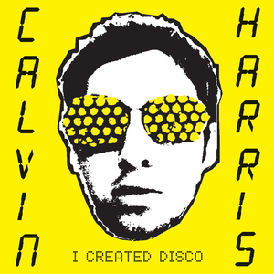
The artist name is written in calculator style font and this is the biggest writing on the cover. so this is clear for whose album is even if the audience ain't familiar with Calvin harris's face.


The bright background colour yellow which will straight away catch the viewers attention.This is a good advertising for the album because its hard to miss so many people will stop and look and read it.


 The background of the advertisement is the same as the actual Cd cover. so the advert and the CD cover will look similar but the advert will have more detail and less image.


The album title is written in a calculator style font which this fits  with the electronics style of the album.


 The image is used is quit artistic there's a lot of levels of contrast making David Guetta stand out more as he stand out the shadow.

The black and white style help the title for the album. 'one love stand out. colour pink is a stereotypical colour to be used in house genre. The font of the album title is like paint. this is quit messy this could suggest that it is n't something like classical music and that it is loud and fun.


The layout of this digipak is kept very simple which leaves the audience wondering what contents could be like as not  much has been given away from the front cover itself allowing the music to speak for it self.


The back page of the digipak is kept simple with the white and pink colour scheme, this is allowing you to focus purely on the track names. the messy theme throughout.